

Sep 27, 2023, 03:31 PM ETThe Seattle Sounders introduced their new club crest and brand identity on Tuesday. Seattle Sounders
Another MLS club has rebranded. A new crest and some changes in colors have come to the Seattle Sounders, but this rebrand is not like the others.
While every one of the league’s original clubs, founded in 1996, have redesigned their crests, and a further four have also done so, the Sounders did not embark on their rebrand intent on a radical change meant to mark a new way forward like their identity-shifting peers. They had no putrid history to put behind them, new ownership ushering in a new era or desire to position themselves as a more “authentic” version of the same club they have always been.
The Sounders were the first MLS club that rebranded with the goal of truly embracing their history and the community they’ve developed around the club. With the Sounders’ 50th anniversary set for 2024, it marked the perfect opportunity to reintegrate a legacy that stretches back through five leagues into their visual identity, and reflect a culture that has grown since their inaugural MLS season in 2009.
– Stream on ESPN+: LaLiga, Bundesliga, more (U.S.)
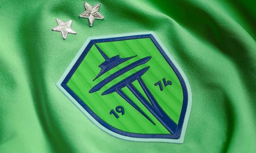
The result is a new crest that is essentially a stripped-down version of the previous logo. Gone is the banner and club name. With it goes the blue block that made up half of the two-part shape. What is left is the Space Needle on a familiar-shaped green background with the year of the club’s founding, 1974, added in.
Minimalism has ruled the day in design for years now, and that’s especially true in sports. Make things simple and make them flat. While that was once novel and striking, that is no longer the case, and the Sounders’ new crest falls in the same bucket.
Editor’s Picks
2 Related
The Space Needle, while defining of Seattle and having become a central part of the Sounders’ identity, does not alone scream “Seattle Sounders” or even “soccer team,” which is going to pose problems considering the tower makes up practically the entirety of the crest. The Rave Green color being so dominant, with only minimal touches of accent colors Pacific Blue and Heritage Aqua, may present some problems on a Rave Green kit as well.
The benefit of the approach the Sounders took to this crest is that with so little to it, it’s difficult to get much wrong, but it also gets little right. In all, the new crest is certainly clean and checks the boxes of basic design, which the old crest didn’t thanks to its odd clashes of shape, but it also leaves a lot to be desired.
The Sounders didn’t simply redesign their crest, though. They introduced a series of secondary and tertiary marks, and it’s there that they really succeeded in harnessing the history and culture of the city and club.
Their primary wordmark is a modern take on the 1970s Sounders logo that evoked the water of the Puget Sound, and it is beautiful. The club’s new monogram takes the same approach as the wordmark, utilizing the sound and wave, but simply reads “SFC.”
Five decades later, you continue to shape our identity. ❇️ pic.twitter.com/VceC5g4yFs
— Seattle Sounders FC (@SoundersFC) September 26, 2023
The Sounders also touched on their history for a stupendous tertiary logo, featuring a carnation flanked by the “1974.” Seattle players have handed their fans carnations at the final home match of the season dating back to their time in NASL, making this a beautiful logo one that also speaks to the club’s history, uniqueness and ties to their fans.
The final mark brings back the orca that featured in their brand when the club played in the A-League and APSL. It’s a fun and playful design that incorporates a soccer ball and should be an immediate hit on hats and shirts. It and the carnation also open up plenty of new inspirations and opportunities for change kits in the years to come.
STREAM FUTBOL AMERICAS ON ESPN+
Herculez Gomez and Sebastian Salazar debate the biggest storylines and break down the best highlights that soccer in the Americas has to offer. Stream on ESPN+ (U.S. only)
The secondary and tertiary designs the Sounders have introduced are perfect examples of excellent storytelling that evoke a club’s history and soul. They reflect the extensive fan engagement that the club did to inform their rebranding process, which clearly guided their vision. While that may seem like an obvious step to any club’s rebranding, it is what the Columbus Crew, Chicago Fire and CF Montréal failed to do, resulting in such bungling failures that they had to make significant changes to their rebrand within two years of debuting them.
Exactly how the Sounders managed such outstanding work in so many aspects of their rebrand, only to choose a primary crest so uninspired, is bewildering, but it is hardly debilitating. In fact, their secondary crest, which takes the primary mark and adds the gorgeous wordmark below it, may provide the best peek at how the Sounders look in the years to come.
By combining the primary crest and wordmark, the Sounders have a more complete brand and it shows how they can pair, accent and make clever decisions in using their secondary and tertiary marks to put forth an identity that has the depth and soul their primary crest lacks. That is befitting of a club soon to embark on their 50th year.
This is not a brand-new Seattle Sounders FC. While they may look different, they are not pulling an LA Galaxy and rebranding to be the club of David Beckham. They are not trying to leave their Wizard of Oz days in a baseball stadium behind them like Sporting Kansas City. There isn’t a whiff of CF Montréal begging to be taken seriously or FC Dallas trying to start anew in a new stadium.
The Seattle Sounders wrap their arms around their history, that is rooted in its city and has a culture that is not manufactured but built by its community. That is what guided this rebrand, and the extensive fan engagement throughout comes through clearly in the final product. For maybe the first time ever, an MLS club has rebranded from a place of pride. Even where the rebrand falls flat, and certainly in where it shines, that shows from the first mark to its last.